Published August 30, 2022
Hanging Pictures At An Exhibition
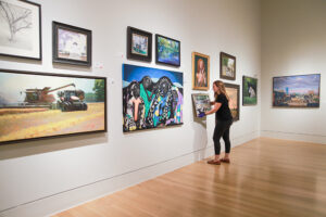
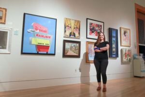
At the 98th Hoosier Art Salon, which opened on Aug. 27 at the Indiana State Museum, visitors will see 150-plus works by artists from around the state. What they might not notice – but should – is the artistry involved in hanging the exhibit to make it look as impressive as possible.
That’s the work of Meredith McGovern, the museum’s arts and culture collections manager, and Ron Kellen, exhibit preparator/production and lighting specialist. Once the judges selected the pieces that won awards, McGovern and Kellen spent a solid week organizing, laying out and hanging the art that now covers the walls in the Ford Gallery.
Here, in her own words, McGovern, who’s been with the museum for 17 years, explains the process.
 I didn’t know how to hang an art show until I’d been here for several years. It’s something I really enjoy doing. I work with the art collection here at the museum, and so I’m always handling art in my everyday job. So, it became one of my projects – I’m handling the art, I’m getting it to the gallery, I’m helping hang it.
Initially, I didn’t design the show. The Hoosier Salon would contract with someone, or one of their volunteers would do it. I took over laying out the show three to four years ago.
Laying it out, you have to have an eye for design and understand the balance, finding pieces that complement each other and recognizing when you don’t have that yet.
It’s a real team effort to get this into the building. Coordinating with the Hoosier Salon, the artists and our staff.
The first day is daunting. There are 150-plus pieces. How do I make sense of this?
Usually where I start is I try to divide them by size. Trying to fit everything in the gallery is my first challenge. So, I start with the largest pieces and try to set large pieces on the walls because I know I’ve got to get those in. From there, I can get the medium pieces and then the smaller pieces in. But trying to set the large ones around each wall – that’s my first task.

How can I get a good mix so it’s not all oil paintings next to each other or all abstracts on one wall? I want to make sure abstract work is mixed in with traditional landscape with the portraiture so that as someone’s coming through the gallery, it’s not like they’re seeing the same thing over and over. You don’t want to walk through a gallery and there’s 20 faces lined up. You lose something. But by spreading them out, it becomes a treat to see a portrait among a landscape among an abstract. I want to get a good blend of what we have on every single wall.
From there, I’m looking at elevations. I don’t want anything to be stacked too high. I try not to stack three high because it takes away from the artwork. When you’re craning your neck to see a piece, that’s not what we want. We want people to come through and have a comfortable experience viewing the artwork and for each artist to be able to have a good representation. We want everyone’s piece to be seen.
I’m also looking at color – which colors complement each other? Which ones create a little bit of tension? Which ones push color forward? A color that might be muted in one piece, if I put it next to something that has a similar color in it, I can push those colors and make something pop that might not pop without that other piece beside it.
An abstract piece with black, white and red wouldn’t be placed next to a piece with similar colors because it would be too much. I think they would compete with each other. But by putting them on separate walls near each other, we’re creating a flow where there is some repetition – more harmony and balance, repeating colors and tones, but not slapping someone in the face with them.
 I might try a piece in one spot, but sometimes that’s just a holding spot. Sometimes it will end up there, but other times I move it around. Some walls come together really easily. Then other walls are more of a headache. I know when I have to walk away – when it’s too much.
You can get into a rut. I put so many steps on my tracker – I’m hitting 10,000 steps by lunchtime because I am puttering around thinking, “Which pieces work?”
There’s a formula to this. We like to hang “60 on center.” There’s a center line that runs through every wall and that’s at the 60-inch mark. That’s comfortable viewing for the average visitor – where the center of the piece is 5 feet off the ground. You’ll know when you’re hanging if something is too high or too low because you can step back when you get off the ladder and you’ll be able to tell.
There is math involved in all this. Usually, the math gets a little trickier when you’re trying to group two pieces over one. But you can see it all worked out. It all comes together.
Ron does the lights. With this gallery and with this show, it’s a little different. Typically, with artwork, we have low light levels, especially with works on paper. But with the Hoosier Salon, the intention is to sell the artwork, to represent it as best as possible. So we have the lights up higher in this gallery so they shine a little more.
This is one of those projects we look forward to every single year. We love seeing the art come through, we love being able to get the first peek. It’s challenging, but it’s really rewarding to make everything work together and to make a beautiful gallery.


